Hello, and welcome (back) to my website! Put yourself in this situation: you’ve just come across an old friend’s place for the first time in years, and both the friend and the place just doesn’t look like how you remembered it. You may think it’s better now, or just ‘certainly different’.
That is pretty much what happened with me over the past couple months, with my entire personal brand. This article details what happened, and the design process and thinking behind this ‘new look’ of sorts.
Designing The New Logo
When creating a rebrand, I had to think about what ‘represented’ me the best; what people look at and think “what the hell that’s Wale”. Because of the quick recognition factor, I decided to retain the ‘turned A’ element (in short, the character ‘ɐ’), which has been present in the short-form profile pictures ever since I started being active on the internet. It also has another meaning, in which it represents the ‘near open central vowel’ in the International Phonetic Alphabet. This means that it represents the ‘uh’ sound in the word ‘bath’ in some British & Australian accents (example), or more importantly - the ‘a’ in ‘Wale’ in Australian English.
As for why it reads top down rather than horizontally, it was the simplest way to render the lettering without compromising on design quality. I am very aware that this logo has a element that’s perfect for the “don’t dead open inside” memes, however… just look at the cross-section between the letters. It’s still not perfect, but it’s passable.
Colouring the new logos
The best part about the redesign is that I had the chance to take a proper look at adding colour, something that the previous site direly lacked. I then decided to create multiple colourways, with the intention of assigning meaning based on interest category. Get used to these, as you’re going to see these more often.


The interest group assignments, from left-to-right, as of writing at 2024-12-21.
Colourway 1
- Default (as seen on the website pages)
- unassigned
- Photography-specific material (photo books, some photos themselves, etc.)
- Technology-specific material (material in relation to programming, DIY projects, etc.)
Colourway 2
- unassigned (all)
Is that a new font?
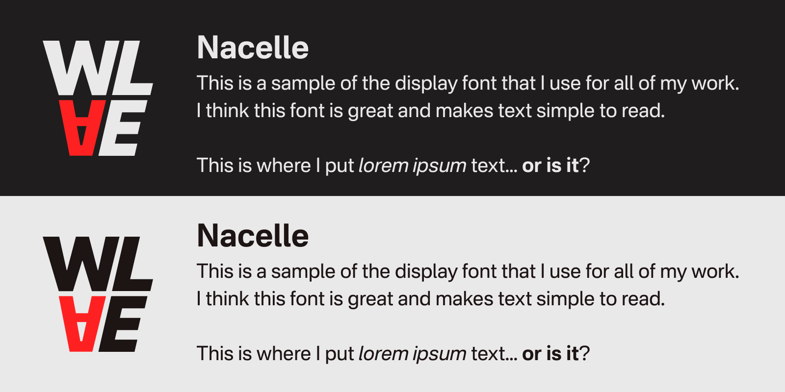
Instead of utilising General Sans, as in the previous site, I had decided to use a sans-serif font named ‘Nacelle’. Nacelle is a sans-serif font, designed by Sora Sagano, and is a open font under the creatively named ‘Open Font License’, compared to General Sans’ closed-source license, which made integrating into a website much easier, as I didn’t have to worry about the font’s license having a clause that prevented ‘uploading [the font] to a public server’.

Oh yeah, what’s with the title?
I tried to be funny in a website largely intended for my professional image. Note the spelling of ‘Bellair’; at the time where I had decided on rebranding, I was walking around Kensington, a suburb in Melbourne’s inner city. Running parallel to the railway station, is a road with the name of ‘Bellair St’. I am very sorry.
If you somehow stomached my little rambling on how I designed my new logo, thank you so much! I hope you enjoy the new brand, and a small bit of my thought process. I can’t wait to post more blog posts in the new year.